Chapter Two
Professional Printing
Lithographic and digital printing, proofing, imposition, colour management and computer-to-plate.
Next chapter in productionGlenside Print Resource Centre
Practical guidance on artwork, colour, paper, print production and finishing - written from the pressroom, not copied from a manual.
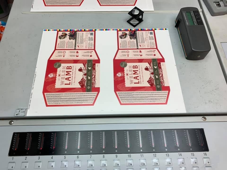
Explore the library
Start with the fundamentals, then explore professional production, finishing, design resources and printing heritage.
Bleed, colour, resolution, paper and the essentials of print-ready artwork.
02Lithographic, digital, colour management, proofing and computer-to-plate.
03Binding, folding, laminating, foiling, die cutting, creasing and perforating.
04Templates, PDF export, Canva, Adobe, Affinity and practical artwork checks.
05The tools, methods and knowledge that shaped generations of printers.
06Clear answers to the questions customers ask us every working week.
Featured article
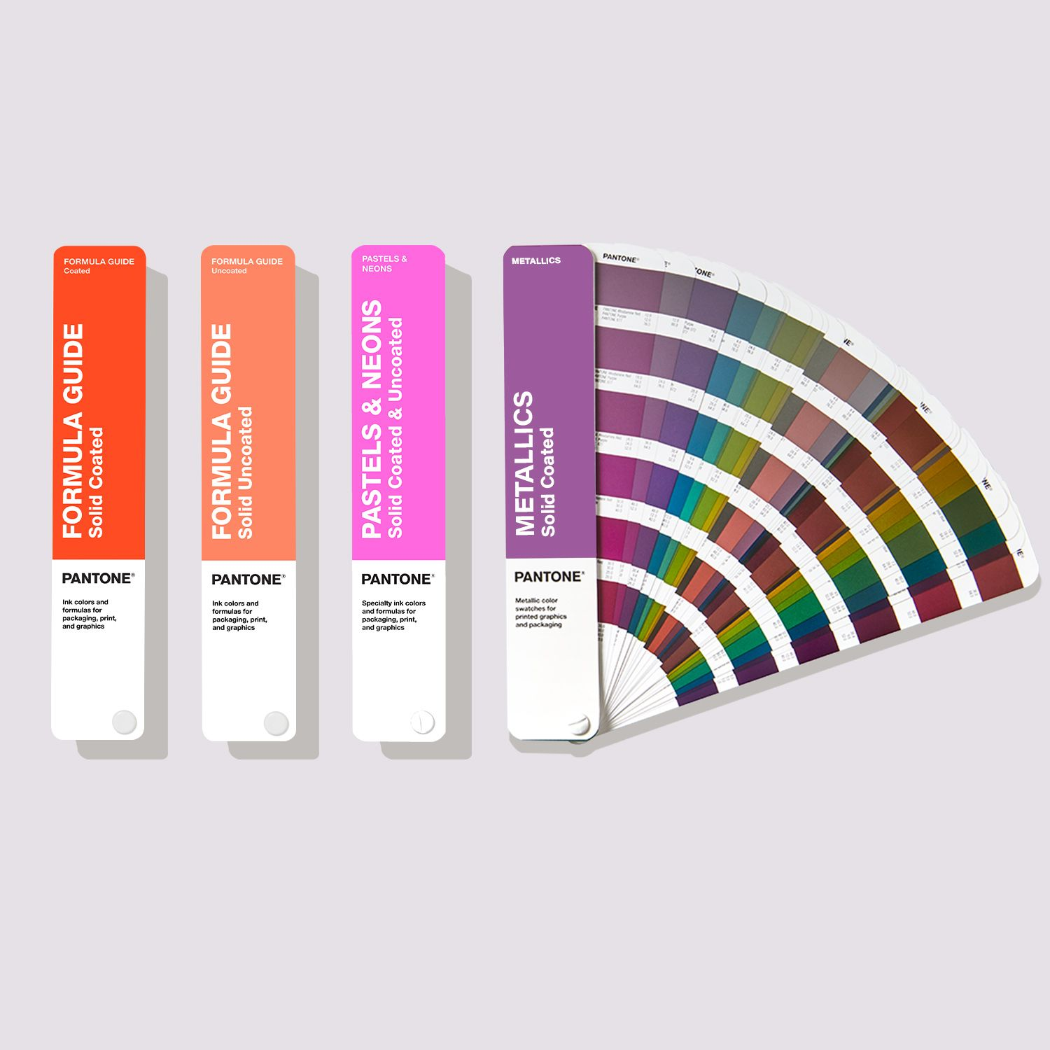
Why professional printers still rely on the Pantone Matching System when an exact brand colour matters.
A Pantone guide is more than a colour chart. It is the common language shared by designers, printers and customers when colour must be consistent from one print run to the next.
Read the full articleChapter One
The subjects that prevent most artwork problems before a job ever reaches the press.
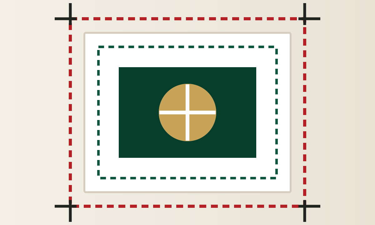
Why 3mm bleed matters and where important text and logos should sit.
Read article →
Why bright screen colours can change when they are converted for print.
Read article →When a genuine mixed ink is worth using and why consistency matters.
Read article →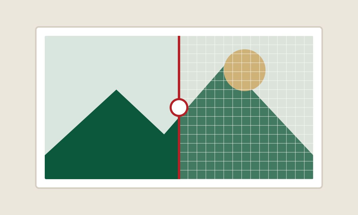
Why a picture can look sharp on screen but still print badly.
Read article →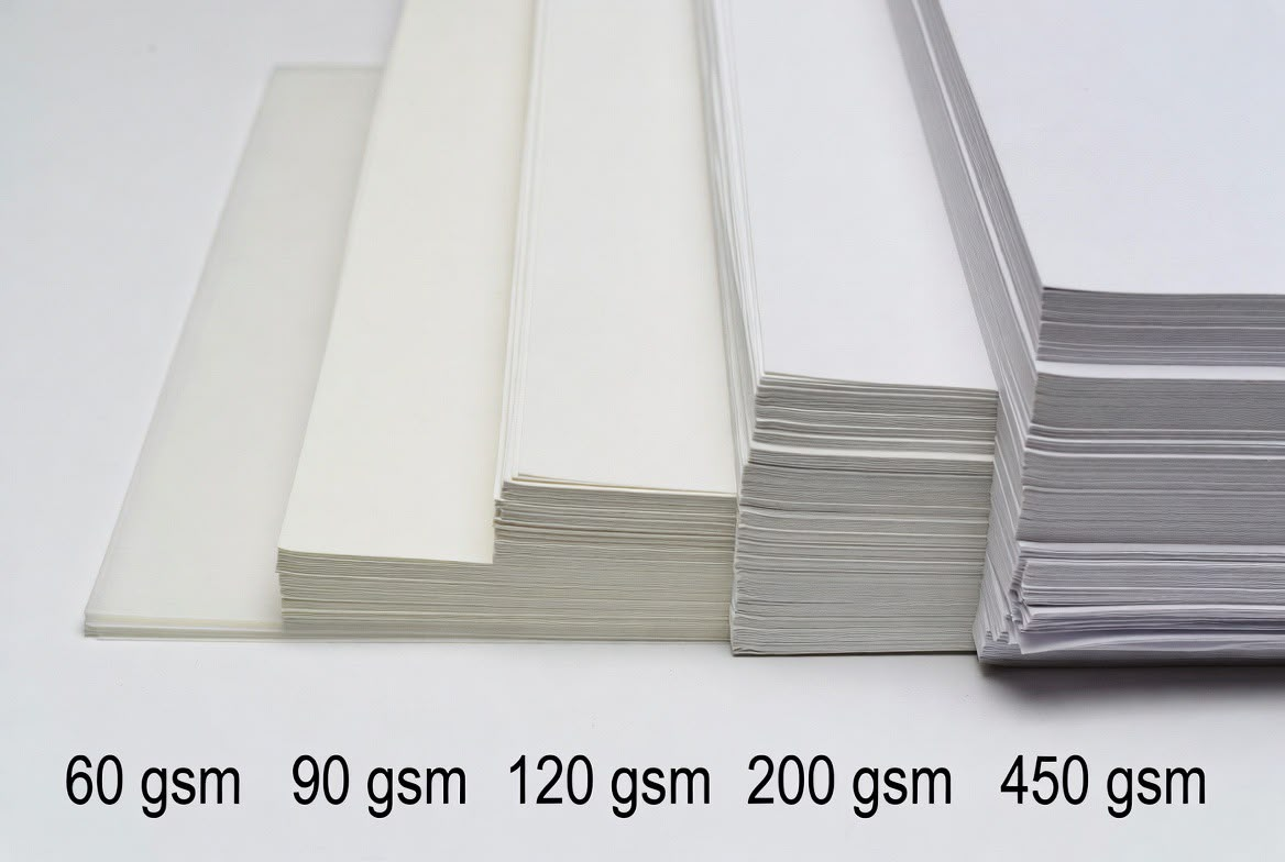
What GSM means and how to choose a paper that suits the job.
Read article →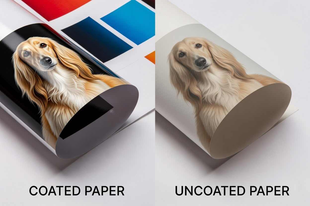
How the paper surface changes colour, detail, feel and writing performance.
Read article →Chapter Two
Lithographic and digital printing, proofing, imposition, colour management and computer-to-plate.
Next chapter in productionChapter Three
Binding, folding, laminating, foiling, die cutting, numbering, creasing and perforating.
Next chapter in productionChapter Four
Templates, PDF export settings and practical guidance for Canva, Adobe and Affinity users.
Expanding soonChapter Five
From metal type and process cameras to Macintosh and computer-to-plate.
Linked to the Glenside ArchiveAsk a Master Printer
Real questions, answered plainly and without unnecessary jargon.
A single black ink can appear weak across a large solid area. A carefully built rich black may be better, but it must suit the printing process and the job.
Usually because the original image does not contain enough detail at the size it is being printed. Enlarging a small image stretches pixels rather than creating detail.
It depends on quantity, turnaround, colour requirements and the type of job. At Glenside we use both and choose the route that makes practical and financial sense.
From the Pressroom
Printing has changed enormously over nearly two centuries. One thing has not - every job deserves the same care, attention and craftsmanship, whether it is one business card or one hundred thousand brochures.
Jonathan Glyn Davies
Every job is different. Tell us what you are trying to produce and we will help you choose the most practical route.