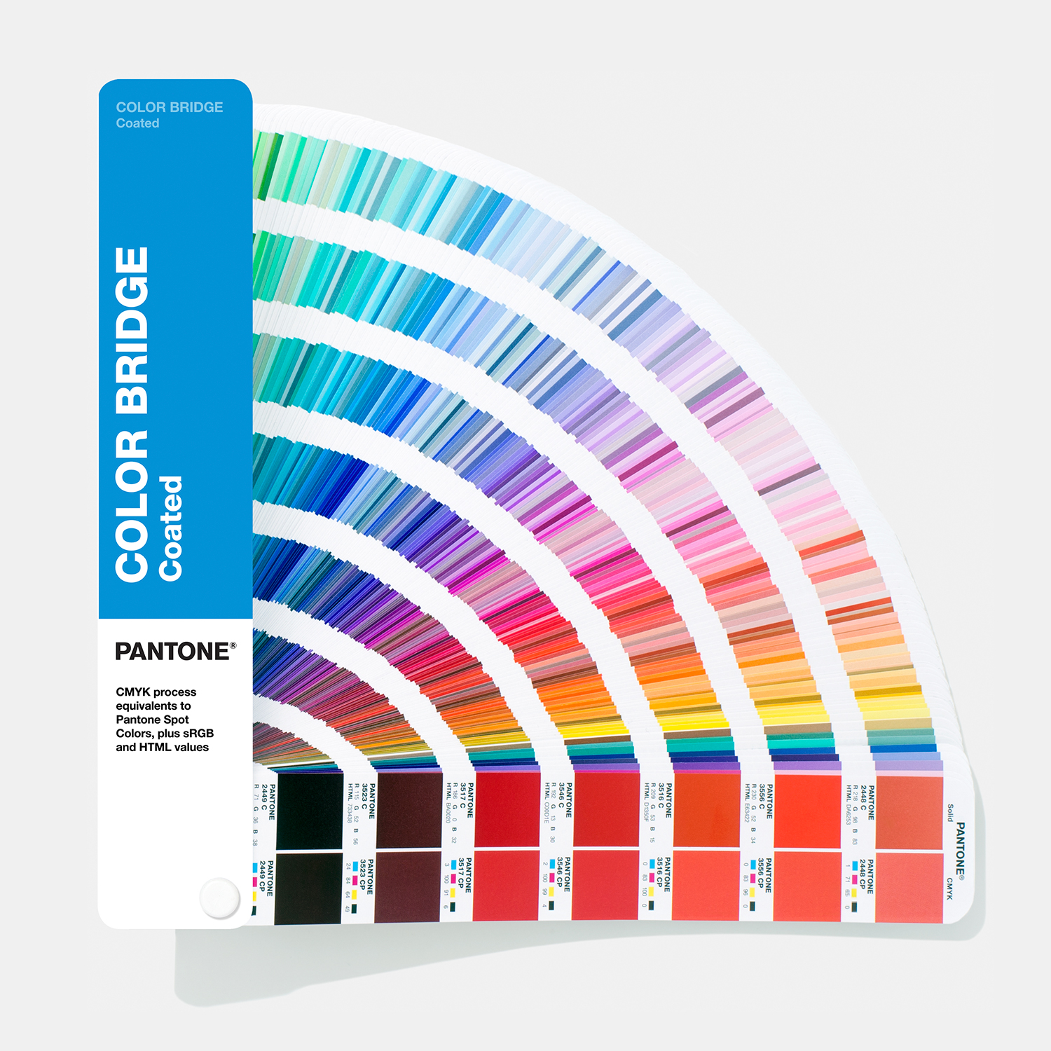
What is a Pantone colour?
A Pantone colour, often called a PMS colour, is a specially formulated printing ink mixed to an internationally recognised standard.
Unlike CMYK, where four inks combine on press to create thousands of colours, a Pantone ink is mixed as one exact colour before it reaches the press.
Why use Pantone inks?
Pantone colours are particularly useful for corporate identities, logos, sports clubs, universities, packaging and premium stationery.
When a business has invested in a particular brand colour, consistency matters from one print run to the next.
Pantone versus CMYK
CMYK is ideal for photographs and full-colour work, but some bright oranges, violets, greens, metallics and fluorescents cannot be reproduced accurately from four process inks.
Where the colour itself is part of the brand, a genuine spot ink may be the professional choice.
Can digital presses print Pantone colours?
Digital presses can simulate many Pantone colours very well using CMYK toner, but this is still a simulation.
Where an exact match is critical, lithographic printing with a genuine mixed ink remains the benchmark.
Coated and uncoated guides
Pantone references often end in C or U. C means coated paper and U means uncoated paper.
The same ink can look noticeably different because coated paper keeps more ink near the surface while uncoated paper absorbs it.
A Master Printer's perspective
Colour is not only about appearance. It is about consistency, trust and reputation.
Sometimes CMYK is exactly right. Sometimes a Pantone ink is worth every penny. Knowing the difference comes from experience.